How to Choose the Right Font and Colors for Your Business Sign to Maximize Visibility and Brand Impact
July 2, 2025
Choosing the right font and colors for a business sign is key to catching people’s attention and making a good impression. The best font and color choices depend on clear readability, matching the brand’s personality, and standing out in the environment where the sign will be seen.
Fonts should be easy to read from a distance, and colors must create strong contrast for visibility. It’s important to think about the message the business wants to send and who will see the sign.
A well-designed sign uses font and color choices that work together to make information quickly understood and memorable.
Key Takeaways
- Font and color choices must focus on readability and brand fit.
- Good contrast improves visibility for different environments.
- Sign design should communicate clearly to the target audience.
Understanding the Importance of Fonts and Colors in Business Signage
Fonts and colors work together to make business signs clear and attractive. They help communicate the brand’s personality and make important information stand out.
Choosing the right elements affects how people see the business and whether they remember it.
Role of Typography in Business Signage
Typography is the style and arrangement of fonts on a business sign. It affects how easy the sign is to read from a distance or at a glance.
Clear fonts like sans-serif are often chosen for their simplicity and legibility. Fonts also express the brand’s personality.
For example, bold and modern fonts convey strength and innovation, while script fonts suggest elegance and tradition. The font size matters too; larger fonts draw attention but must balance with space.
Using too many font styles or complicated fonts can confuse viewers and reduce impact. The best typography choices keep the message simple, readable, and matching the brand identity.
Color Choices and Their Impact
Colors grab attention and influence emotions. Bright colors like red or orange can create urgency or excitement.
Cooler colors like blue and green offer calm and trustworthiness. Effective business signage uses contrasting colors to increase readability.
For instance, white text on a dark background stands out more than colors that clash or blend. Certain colors also tie directly to brand identity.
A company may select colors that customers already associate with their reputation. Consistent color use across signs builds recognition over time.
Avoid using too many colors. Stick to two or three main colors that support the brand’s look and make the sign easy to understand quickly.
Signage as a Branding Tool
Business signs are a core part of branding. They help create a visible and memorable brand image in the community.
The fonts and colors chosen must match other design elements like logos and marketing materials. Signs reflect the brand personality.
A playful, casual brand will use different fonts and colors than a formal, professional one. This consistency helps customers recognize the business in many places.
Defining Your Branding and Audience

Understanding a business’s core identity and who it serves is crucial when choosing font and colors. These choices should reflect the brand’s style, goals, and the people it wants to reach.
Aligning Design Choices with Branding Strategy
A business’s branding strategy shapes every design decision. Fonts and colors need to match the brand identity.
For example, a modern tech company might use sleek fonts and cool colors like blue or gray to show innovation and trust. Traditional businesses may pick classic fonts and warm colors such as red or brown to convey reliability.
Consistency across all marketing materials ensures customers recognize the brand easily. Before selecting fonts or colors, reviewing the brand’s mission, values, and existing style guide is important.
This keeps signs aligned with the overall strategy and enhances customer perception.
Understanding Your Target Audience
Knowing the target audience helps create signs that speak directly to potential customers. Different groups respond to fonts and colors differently based on age, culture, and preferences.
For example, younger audiences might prefer bold, colorful fonts, while older customers might find simple, easy-to-read fonts more appealing. Colors can also affect emotions; blue often feels calm, while red grabs attention.
Researching customer demographics and tastes is essential. This allows businesses to select design elements that attract and keep the right audience’s interest.
Communicating Brand Personality
Fonts and colors communicate a brand’s personality without words. A fun and creative brand might use bright colors and playful fonts.
A serious, professional brand will opt for muted colors and clean, straightforward fonts. The design should match how the business wants to be seen.
Using style guides or mood boards can help define and keep the brand personality consistent in every sign created.
Choosing the Right Font for Business Signs
Selecting the correct font is essential for making a business sign stand out and communicate clearly. This involves matching the font style to the type of business, ensuring easy reading from a distance, and reflecting the brand’s personality while keeping the text practical.
Font Styles for Different Business Types
Different types of businesses benefit from specific font styles. Serif fonts like Times New Roman or Garamond work well for traditional or professional businesses such as law firms or financial services.
These fonts convey trust and reliability. Sans serif fonts like Helvetica , Open Sans , and Futura suit modern, clean brands such as tech companies and startups.
They look simple and clear, making them great for quick reading. Script and decorative fonts should be used cautiously.
They fit creative fields like fashion or art but are harder to read from afar. Using them for short words or logos, not full sign text, is best.
Readability and Legibility Factors
Readability means how easy it is to read the font overall, while legibility refers to recognizing individual letters. Both are crucial for business signs.
Bold fonts improve visibility, especially from a distance or under different lighting conditions. Fonts with simple, clear shapes like Franklin Gothic or Open Sans are more legible.
Avoid overly thin or tightly spaced fonts. High contrast between text and background color also helps letters stand out.
Signs viewed from a moving vehicle need large, clean fonts for quick comprehension.
Balancing Brand Image with Practicality
The font chosen must reflect the business image without sacrificing clarity. A luxury brand may use a stylish serif or display font but should keep it readable.
If the font style is too decorative or unique, it might confuse viewers or look unprofessional. For example, a tech company should avoid ornate fonts, even if they look trendy, to maintain a clear message.
Font size, spacing, and weight must balance appearance with real-world conditions. Practical readability often outweighs creative choices when designing effective business signs.
Examples of Popular Fonts for Signage
Some fonts stand out in signage due to their mix of style and clarity:
- Helvetica : A clean, neutral sans serif font widely used for its legibility.
- Franklin Gothic : Bold and simple, good for headlines and large text.
- Times New Roman : Classic serif font, suitable for formal business signs.
- Garamond : Elegant serif but best for upscale, smaller amounts of text.
- Futura : Geometric sans serif, modern and clean for various industries.
- Open Sans : Designed for readability on screens and signs.
Choosing among these can depend on brand identity and physical sign location.
Optimizing Font Size and Spacing for Readability
Choosing the right font size and spacing is crucial for making business signs clear and easy to read from a distance. Proper size, spacing, and weight help improve visibility and guide the viewer’s eye to the important information.
Determining Appropriate Font Size
Font size depends on where the sign will be placed and how far away people will be when reading it. Larger font sizes are needed for signs viewed from a distance, such as roadside or building signs.
For example, a sign meant to be read from 50 feet away should have letters at least 4 to 6 inches tall. Indoor signs or those viewed closely can be smaller, around 1 to 2 inches high.
Using a font size that is too small can make the sign hard to read quickly. Too large can waste space and reduce message impact.
Importance of Kerning, Leading, and Weight
Kerning is the space between individual letters. Proper kerning makes letters neither too crowded nor too far apart, improving legibility.
Leading affects the space between lines of text. Adequate leading prevents lines from blending together, making multiple lines easier to read.
Weight refers to the thickness of the font. A medium to bold weight increases visibility from a distance, while very thin fonts can be difficult to read, especially on signs exposed to sunlight or shadows.
Adjusting kerning, leading, and weight together creates clean and clear text that stands out.
Ensuring Consistency Across Signs
Consistency in font size, kerning, leading, and weight helps build brand recognition and makes signs easy to understand.
If multiple signs use different font sizes or spacing styles, it can confuse customers and reduce professionalism. Keeping these elements the same across all signs helps people identify the business quickly.
Businesses should create style guidelines for font size and spacing to follow on every sign, whether indoor or outdoor.
Selecting Effective Color Combinations
Choosing the right color combinations affects how well a business sign stands out. The focus should be on clear contrast, matching colors with the brand, and picking hues that increase visibility.
Principles of Color Contrast
Good color contrast helps the text and background stand apart clearly. Light colors work best on dark backgrounds, and dark colors are easier to see on light backgrounds.
High contrast improves readability from a distance. For example, black text on a white background or white text on a dark blue background offers clear contrast.
Low contrast pairs like gray on white or yellow on light green make reading difficult. Contrast also affects how colors appear in different lighting.
Signs outside should have more contrast to stay visible in sunlight. Interior signs can use softer contrast but still need clear separation between text and background.
Complementary and Brand-Aligned Colors
Complementary colors are opposite each other on the color wheel, such as blue and orange or red and green. These pairs create strong contrast and catch attention quickly.
Using brand colors keeps signs consistent with the company’s identity. If a brand uses specific shades, the sign should include these colors while ensuring enough contrast for clarity.
For example, a company with a red logo might use white or black text to complement it. Balancing brand colors with complementary pairs helps maintain visual appeal and brand recognition.
It’s important not to overload with too many colors, which can confuse viewers. Two to three colors are usually enough.
Best Colors for Maximum Visibility
Certain colors stand out more than others under different conditions. Yellow, white, and bright red are often used for high visibility because they catch the eye quickly.
For backgrounds, dark blue, black, and green provide good contrast with bright text. Avoid colors that blend into surroundings or make letters hard to read from afar.
Signs meant for nighttime should use colors that reflect light well or include illumination. Fluorescent and neon colors improve visibility but must be paired with contrasting text to remain readable.
A simple chart for contrast examples:
| Text Color | Background Color | Visibility Level |
|---|---|---|
| Black | White | High |
| White | Dark Blue | High |
| Yellow | Black | High |
| Gray | White | Low |
| Light Green | Yellow | Low |
Applying Color Psychology to Business Signs
Color choices affect how customers feel and remember a business. Different colors cause different reactions in people’s minds.
Using the right colors helps a sign stand out and connect with the target audience.
Warm and Cool Colors: Psychological Impact
Warm colors like red, orange, and yellow often create energy and excitement. They attract attention and can make a sign feel lively or urgent.
Red, for example, can stimulate appetite or create a sense of urgency, which might help certain businesses like restaurants or sales events.
Cool colors such as blue, green, and purple tend to calm people and suggest trust or professionalism. Blue is common for banks and healthcare because it feels safe and dependable.
Green connects well with nature and health, making it popular for organic or wellness brands.
Color Choices for Brand Recognition
Consistent color use helps customers quickly recognize a brand. Businesses should pick colors that match their market and personality.
For example, a tech company may choose blue to show reliability. A kids’ toy store might use bright warm colors to seem fun and energetic.
Using the same colors across signs, logos, and marketing strengthens brand recognition. Selecting 2-3 main colors works best.
Too many colors can confuse the message. Also, consider color contrasts to make the sign easy to read from a distance.
High contrast pairs like black on yellow or white on blue improve visibility and help the brand stand out.
Maximizing Visibility and Accessibility
Visibility is key for any business sign. Using the right colors and fonts can make a sign easy to read from a distance and in different lighting.
Making signs accessible ensures everyone, including people with vision challenges, can understand the message.
High Contrast for Effective Signage
High contrast between the text and background is essential for clear visibility. Dark letters on a light background, or light letters on a dark background, help the sign stand out.
Examples of high-contrast pairs:
- Black on white
- White on navy blue
- Yellow on black
Avoid low-contrast colors like light gray on white or red on green. These combinations make signs harder to read, especially from far away or in poor light.
Selecting Fonts and Colors for Various Lighting Conditions
Signs need to work well whether it is bright daylight or at night. Glossy finishes can cause glare, making text harder to see.
Matte finishes reduce glare and improve readability. For night visibility, use colors that stand out under artificial light.
Bright yellows, whites, or reflective materials improve clarity after dark. Avoid colors that fade or blend into the background under artificial lighting.
Accessibility and Inclusivity Considerations
Signs should be readable for people with visual impairments or color blindness. Use simple, sans-serif fonts like Arial or Helvetica because they are easier to read.
Avoid relying only on color to convey important information. Combine colors with shapes or symbols for clearer communication.
Use large enough text—at least 1 inch tall for every 10 feet of viewing distance—to help those with limited vision.
Tailoring Sign Design to Environment and Usage
The environment where a sign is used affects how it should look and perform. Signs need to be designed to handle things like weather, lighting, space, and the type of people who will see them.
Choosing the right font and colors depends on these factors.
Outdoor Signs: Weather and Visibility Factors
Outdoor signs must withstand rain, sunlight, wind, and temperature changes. Materials like metal or weather-resistant plastics help keep the sign strong.
Fonts should be bold and simple to stay clear from a distance. High contrast colors work best outdoors.
For example, black letters on a white background or white on a dark color improve visibility. Reflective or illuminated signs also boost visibility at night or in bad weather.
Placement is key. Signs should avoid shadows and be positioned where sunlight does not cause glare.
The size of the font has to match how far away people will be when they read the sign.
Indoor Signs: Design for Interior Spaces
Indoor signs don’t face weather challenges but must fit into the room’s style and lighting. Fonts can be smaller but should still be easy to read.
Indoor lighting varies, so colors should not blend into the background walls or floors. Matte finishes reduce glare from indoor lights.
Color choices may match a business’s branding but need enough contrast for quick reading. Signs in hallways or corridors need clear fonts to guide people fast.
Materials like acrylic or foam board are common because they look good inside and are easy to mount. Indoor signs often include directional or informational text, so clarity is very important.
Adapting to Surroundings and Location
A sign’s design must blend or stand out depending on its surroundings. In busy areas, simple designs with strong font and color contrasts help catch attention.
For quieter or upscale locations, subtle colors and elegant fonts may work better. Consider nearby buildings, trees, and other signs.
Fonts and colors that clash with the background can make the sign hard to read. Design should complement the area, not confuse or hide in it.
If a sign is near vegetation, avoid green tones. Near bright or busy backgrounds, use solid colors and bold fonts.
Adjusting size, font weight, and color based on location improves the sign’s effectiveness and readability.
Maintaining Brand Consistency Across All Signage
Maintaining consistency helps customers recognize a business quickly. Using the same design choices builds trust and a clear image.
This includes matching your business signs with other visual materials and sticking to chosen fonts and colors.
Aligning with Marketing Materials
Business signs should match marketing materials like brochures, websites, and social media. Using the same logos, colors, and fonts ensures customers see a unified message.
When designs vary too much, it can confuse people and weaken the brand. It is important to review existing materials before creating signs.
This helps keep all visuals aligned with the brand’s style guide. Even small details, such as font size and color shades, should be the same across all platforms.
Using Consistent Font and Color Choices
Fonts used on signs must match those in marketing and other branding tools. Choose fonts that are easy to read from a distance.
Avoid mixing many different fonts to keep the look clean. Colors should also stay consistent to strengthen brand recognition.
Use exact color codes like Pantone or HEX for accuracy. Keeping font and color choices consistent across all signage supports a professional and reliable image.
Future-Proofing Your Business Signage
Choosing fonts and colors that work now and later means thinking about design impact and material use. The sign should stay clear, attractive, and eco-friendly over time, while also fitting the brand’s future direction.
Sustainability in Design Choices
Using eco-friendly materials like recycled aluminum or bamboo for sign bases reduces environmental harm. Paints and inks with low volatile organic compounds (VOCs) prevent air pollution.
Simple, bold fonts are easier to read, cutting down on the need to replace signs due to low visibility. Colors that hold up under sunlight avoid fading and keep the sign looking fresh longer.
Choosing lighting with low energy use, like LEDs, supports sustainability goals. These lights last longer and reduce electricity bills.
Planning signs with modular elements makes replacing parts easier, leading to less waste overall.
Evaluating Long-Term Effectiveness
The sign must keep catching attention and clearly communicate the brand years from now. Designers should pick fonts with classic appeal, avoiding trends that might quickly become outdated.
Color choices should ensure good contrast and legibility in different light conditions. Testing signs outdoors at various times helps verify visibility.
Strategic decisions include creating signs that allow minor updates without full replacements. Using interchangeable panels or adjustable lighting can extend the sign’s usefulness.
Regular reviews of sign condition help plan timely maintenance, so the message stays clear and the brand image strong.
Frequently Asked Questions
Choosing the right font and colors involves clear steps to improve sign readability and brand recognition. Practical choices help customers notice and remember the business easily.
What are the best practices for selecting a font for business signage?
Fonts should be simple and easy to read from a distance. Sans-serif fonts often work well because they have clean lines.
Avoid decorative or overly thin fonts that can be hard to see.
How can a brand color palette enhance business sign visibility and recognition?
Using consistent colors that match the brand makes the sign more memorable. High contrast between text and background increases visibility.
Brand colors also help customers quickly identify the business.
What factors should be considered when choosing colors for a business brand identity?
Colors should reflect the business’s personality and target audience. It’s important to think about cultural meanings and how colors look in different light.
Choose colors that work well together and maintain legibility.
How does font choice impact the readability and effectiveness of business signage?
Fonts affect how easily people read the sign. Clear, bold fonts improve readability.
The right font size and spacing make sure the message can be understood quickly.
Can the choice of colors for my business sign influence customer perception?
Yes, colors can create emotions or feelings about the business. For example, blue often feels trustworthy, while red can attract attention quickly.
The right colors help set the tone for the brand.
What are some examples of effective color combinations for business signage?
Black text on a white background is highly readable.
Yellow text on a dark blue background also stands out well.
Red and white or green and white are commonly used for strong contrast.…
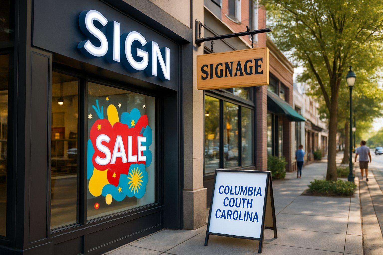
Choosing the best type of signage is key to helping businesses in Columbia, South Carolina attract customers and build their brand. Signs are more than just labels—they inform people about the business and create lasting impressions.

When organizing a conference in Columbia, South Carolina, effective signage plays a key role in guiding attendees and promoting the event’s message. Signs help participants easily find locations, schedules, and important information, making the experience smoother and more enjoyable.

Storefront signs play a crucial role in shaping shopping habits in Columbia by catching the attention of local consumers and influencing their decisions. Effective signs use clear messages, colors, and designs that reflect the store’s identity and invite shoppers inside.

Deciding whether to get a monument sign for a business depends on the need for clear, lasting visibility and strong branding at the location. A monument sign offers a durable, professional way to attract attention and help potential customers find the business easily.

Businesses use different kinds of signs to attract customers, but not all signs are the same. Channel letters are individual 3D letters that light up, lightboxes are box-shaped signs with a lit graphic, and monument signs are large, ground-level structures often found at entrances.

A storefront sign is the first impression a business makes on customers in Columbia, SC. The best storefront signs grab attention, clearly show what the business offers, and stand out from other shops.

Every business in Columbia, SC needs effective signage to attract customers and guide them inside. The right types of signs help businesses stand out, communicate important information, and support brand identity.

Businesses in Columbia, SC use many types of signs to draw customers. From simple banners to large monuments, different styles help increase foot traffic.